Do Good Be Good
Time Frame: 3 weeks
Role: UX/UI designer. Our team consisted on 4 other UX UI designers. I took lead on the visual design, usability testing and synthesis, user persona, secondary research and content inventory
Tools: Figma, Trello, Zoom, Google Forms, UseBerry, Slack, Discord, Youtube, BaseCamp
Deliverables: Hi-fidelity wireframes
Do Good Be Good is a company that provides training to the AmeriCorps. The CEO, Sharon Tewksbury-Bloom, contacted my team to come up with a mobile solution that will be able to provide AmeriCorps members, specifically Conservation Corps members access to Do Good Be Good's content related to the Segal Education Award, which is a monetary fund that is awarded to AmeriCorps members after their service to apply for any educational purposes. It is important to note that Conservation Corps members work on conservation, and restoration, meaning that they take 7-10 day hitches in remote places that do not have cell or Wi-Fi access.
From a competitive analysis, content audit, user interviews, and usability testing we created a mobile learning experience that will allow users with no connectivity to access Do Good Be Good's current content. The content in the app is also meant to be digestible, since the content is very technical and heavy.
What are the AmeriCorps?
How does Do Good Be Good fit with the AmeriCorps?
Why does Do Good Be Good need an app if they already offer online training?
The AmeriCorps is an independent agency of the United States government that engages with more than 5 million Americans.in service through a number of sectors such as VISTA, NCCC, AmeriCorps and more. People who enroll are usually high school graduates or college graduates transitioning into their new career paths. AmeriCorps members are usually paid slightly less than minimum wage for their work hours but are promised with an Education Award at the end of their services, called the Segal Education Award. , which can be used toward any educational purposes. Because the Education Award is considered taxable income, it can be hard to use.
That is when Do Good Be Good. comes in. Do Good Be Good is an Arizona-based company that provides both in-person and virtual training specifically for Arizona AmeriCorps programs and State Service Commissions. The CEO, Sharon Tewksbury-Bloom, by being a former AmeriCorps member herself, it gives her the knowledge and allows her to empathize with active members, allowing her to give out the best training possible. She has specialized trainings regarding the Education Award and how to correctly use it before it expires.
The AmeriCorps has one sector called the Conservation Corps which they cater to a lot of work regarding conservation such as, trail conservation, lake conservation, park restoration and more. They typically work in National Parks where cellular signal is very sparse and Wi-Fi connectivity is rarely available. Sharon came up to my team and I because she has not been able to reach this specific sector of the AmeriCorps because of the connectivity issues. She expressed that she wants an offline app where members of the Conservation Corps could access information about the Education Award while they are on the job.
01. Kickoff Meeting
First, we met with our client to clarify the scope of the project and to learn more about the Do Good Be Good business
In this meeting we learned:
1) First, we noticed that Do Good Be Good has a very big library of content and information. Sharon directed us to focus the content of the app to be about the Segal Education Award.
2) Second, we determined our users, which are members of the AmeriCorps. Do Good Be Good has 2 audiences: program leaders who are the people who actually purchase the trainings, and Conservation Corps members who are the end user. We decided to focus on the end user when designing the app.
3) Third, Sharon brought to the table the idea of "gamifying" the app experience. Sharon expressed that she believed that adding gamification elements to the app might make the information more engaging.
4) Lastly, we discussed that by having Conservation Corps members as our primary user, and them not having access to connectivity was going to be a challenge when going into our research phase because of our tight timeline. Our client understood that and collaborated throughout the project by recruiting users.
02. Content Inventory
One thing that we focused on was creating a Content Inventory. This was done because Do Good Be Good has a big pool of information and as a team we wanted to identify what was the possible content that would be embedded into our design. All of the information was found on the company's Basecamp provided to us by Sharon.
When working on the inventory we noticed different types of media: articles, podcasts, videos, games, and more. We took this into consideration when brainstorming a possible solution for Do Good Be Good.
03. Usability Testing
Next, we focused on doing a Competitive Analysis. We looked at analogous mobile app platforms for learning management systems, direct competitors, workshop facilitation apps for relevant educational features, choice and consequence games and games that facilitate content sharing for gamification elements.
There were a few features, listed in the following matrix, that were present in these platforms which aligned with the user and business goals we had identified and , therefore we considered as part of a unique design solution for Do Good Be Good.
We noted that these listed features, if added, had the potential to attract our target segment into the platform, particularly during an onboarding phase, while achieving the key business goals.
04. Questionnaire
Because of connectivity issues, our client decided to widen the scope from only Conservation Corps Members to any AmeriCorps member that spends significant time on the field. Thanks to Sharon, we were able to screen 5 users and conduct their interviews.
From our 5 user interviews, we identified the following insights:
First, we validated our initial assumption that our target corp members doesn’t have much free time while they are working in the field, operating in a way that is relatively ‘low-tech’, without spontaneous access to virtually connect with training content, peers and family beyond their geographical location, or ‘at a whim’ during the day.
Second, we found that users did universally see a need for further literacy on the education award. These members were highly motivated and engaged to join the AmeriCorps program because of the perks and benefits it provides like licenses and financial aid awards, the majority of users found overall delivery of Education Award content less clear and effective, with a majority of interviewees (⅘) misunderstanding or have further questions on this aspect of training - particularly around the applicability of tax information and its implications around the award after exiting the program
Third, corps members did get access to an online or live training session, the content was not personalized to a level where it was felt to be useful or engaging in terms of its application to a member’s career path.
In summary, users called for better access to award information, in a way that feels personalized to their own situation and delivered in a format that they could easily refer back to when they were back from the field or off duty.
05. User Persona
To draw out core design features that would, therefore, correlate to these insights we synthesized the data we learned from our interviews into target user/persona insights. Please meet, Brooke
Elise Flores
“Life after the AmeriCorps is something that is on my mind a lot”
Brooke is 24 years old and is currently working in the Arizona Conservation Corps. She has a Bachelor;s degree in Environmental Science and she is looking to continue her education in Conservation after her term
Needs: to pursue her Master's degree. To find a job in conservation. To understand how to user her Education Award.
Frustrations: she is too tired to join the trainings provided by her directors after work. Only has cell service when traveling to the nearest town. She does not find the information that she has been provided with relevant to her or engaging.
Behaviors: works 8-10 hour days. after work, she likes to socialize with friends, listen to music. Uses her phone in the field to take pictures, take notes and look at plants with the Naturalist app
From the user person we can see Brooke already has her Bachelor's in Environmental Studies and joined the Conservation Corps to help her determine whether or not she would like to return to school to get her Master's and pursue a professional career in Conservation. When working on the field, she does not have cell service, she must travel to the nearest town to get some service. The education she's received so far from her program about life after AmeriCorps has not been entirely helpful as they are also trying to accommodate high school graduates on her team.
06. So how are users receiving information currently?
Part of the factors contributing to these pain points is a lack of consistency in terms of methods and emphasis across different AmeriCorps programs in providing education and training. In those that we talked to in the course of this project, members used optional Zoom trainings offered by their programs, project management systems they are already using for other parts of their work and some received no information about their Education Award whatsoever.
07. Problem Statement
After our discovery and research phase, we refined and synthesized the relationship we saw between business and the end user's pain points and goals. We came up with a statement that best captured the core challenge and design opportunity.
"AmeriCorps members working in the field need better means of accessing Education Award content, offline, and in a way that supports their lifestyle"
This was a pivotal moment in our design process. That being said, we held a second meeting with our client to agree and align on the core user and business insights we had uncovered. This allowed us to collectively agree on the 4 priority elements of functionality that our design solutions would need to incorporate in order to solve for both the end user and Do Good Be Good.
08. Feature Prioritization Matrix
We then organized the desired features we identified earlier in the process into a feature prioritization matrix. We created this matrix to help Do Good Be Good make appropriate investment decisions that may occur when the app comes to life.
09. Task Flow
Next, we designed a task-based flow that would help us in finding a way to integrate those features into the navigation experience.
The flow you see here maps how a potential user would go through and explore their own learning path, as well as prepare to access the content while offline
10. Sketching
With our top 4 features in mind we conducted a collaborative design studio, focusing on ideating and visualizing layouts that would incorporate those features.
As a team, we evaluated the pros and cons of each, identifying key design decisions through a weighted voting process and then sorted all our solutions into a common set of mid-fidelity/grayscale designs.
11. Low Fidelity Wireframes
As you can see highlighted in the box, we created a common form for the user to fill out when creating their account. Keeping our users in mind, we decided to add 2 extra input fields: Start of Service Term and Activation Code. These would allow the users to have access to the content up to the point their Education Award Expires, which is 7 years after their fist term. Also, the Activation Code will allow Do Good Be Good to continue with her B2B2C business model, program directors would purchase the app's access for their group and giving their specific Activation Code to the members.
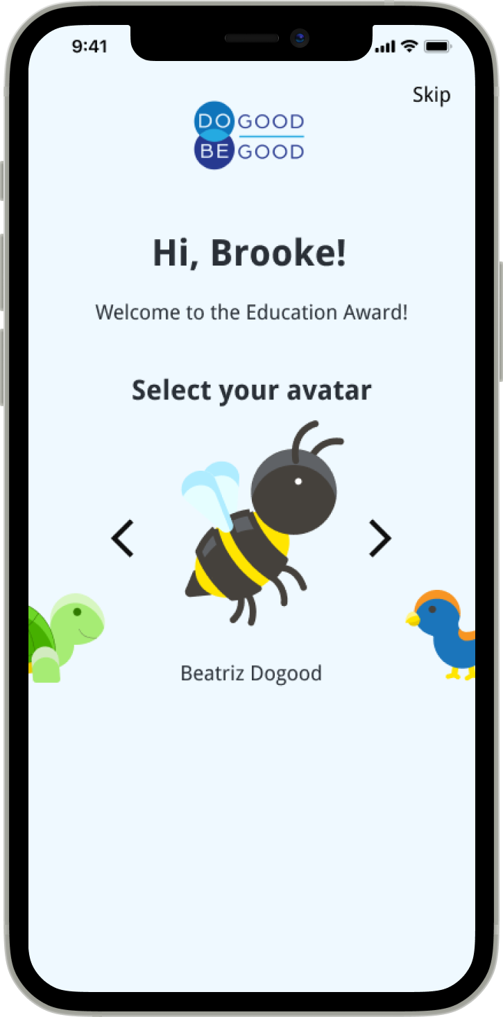
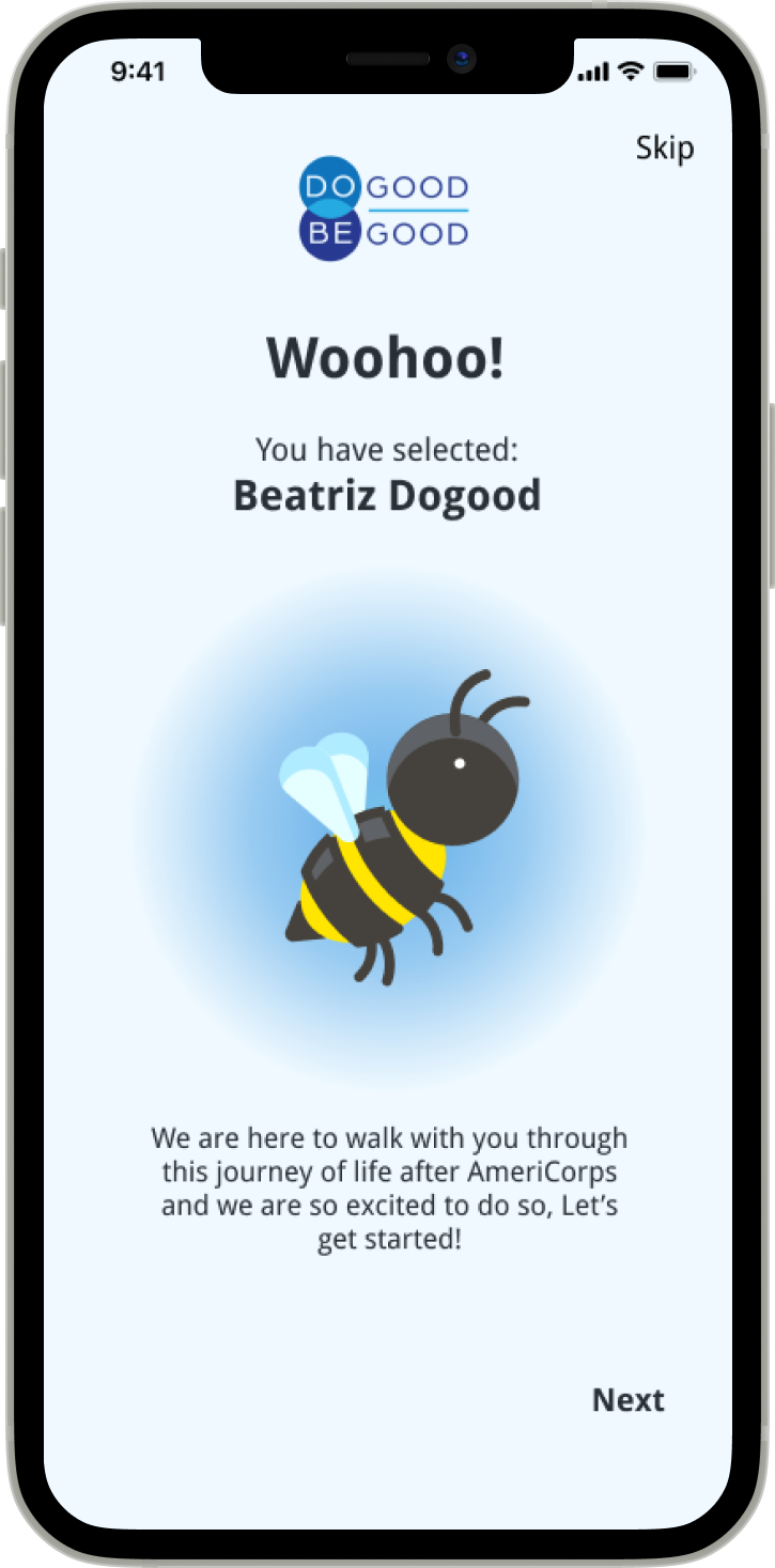
We decided to implement gamification aspects during the on boarding process through the creation of different avatars. The addition of these avatars leaves room for potential development of tracking user data and processes as a metric of learning and achievement.
We focused on the bite-size and personalized learning next. We created multiple, exploratory paths using an action-consequence sequence so users can tailor the content and information they explore to their specific situation, goals and needs.
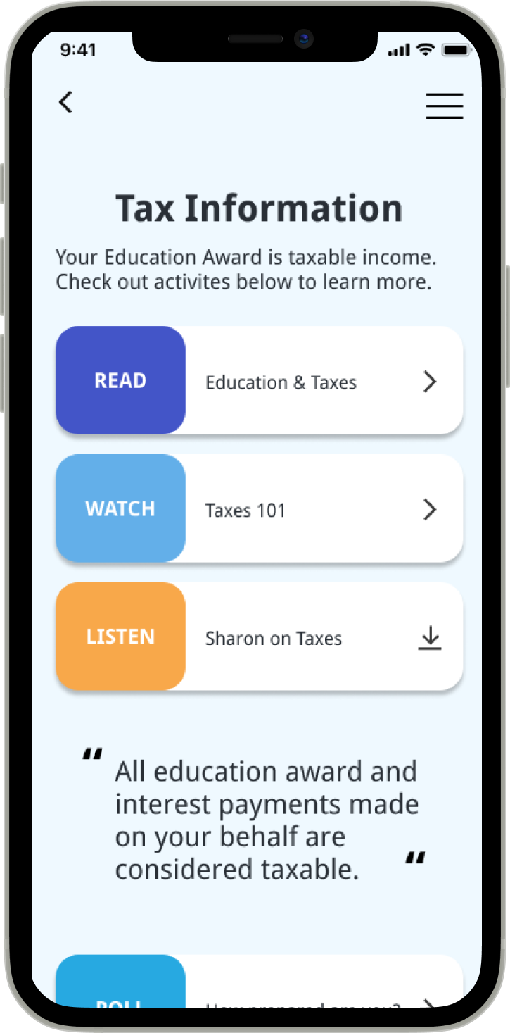
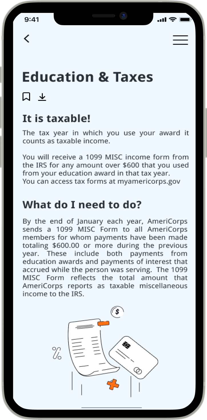
Lastly, we provided offline accessibility to the app's content before and during the learning experience through a toggle and a download icon on specific media content.
12. Usability Testing
We then conducted a usability test with 6 current or former AmeriCorps members to validate our designs. Our users were tasked to complete a variety of scenarios under the pretext of them wanting to continue their education (specifically in a Title IV schoo) after their service term with the AmeriCorps. The intended task flow of this test would be: create an account; select "Continue My Education", find out more about Title IV Schools, and lastly, learn about the tax implications.
100% of our users were able to complete our tasks with no errors or questions. This suggests our task flow was properly structured and the layout of our design effectively guides users in their navigation through the app.
5 out of 5 users rated the app's overall easiness a 5/5. This number was taken out from follow-up question where users went into detail as to why they believe the app's experience is straightforward and intuitive
3 of our features were validated during the usability test. These would then be transferred into our high-fidelity screens:
1) All users enjoyed personalizing and tracking their learning paths by picking an avatar of their choice. Once they saw they could proceed using the ‘bee’ avatar, we noted positive behavioral cues like laughs and smiles.
2) 6/6 users expressed appreciation and satisfaction in experiencing customized learning paths.
3) Users found access to offline content and its functionality highly intuitive.
13. High Fidelity Wireframes
After conducting our usability test, we decided to go ahead and start designing our high-fidelity wireframes. Even though, most of our designs were validated during the test, there are some modifications that needed to be done that were pointed out by users:
Create account button: 3/6 users hesitated around or struggled to find the ‘Create Account’ button before figuring out how to proceed through the app. This could be for several reasons, but to test visual design as the cause, we decided to lift the color of the create account button and bold the copy of ‘New here?’ to increase discoverability.
Incentive to return: When in our wrap up stage of our usability testing, users questioned the use of the home page. They expressed they would like to discover new content rather than downloads. In our second iteration we redesigned it to allow users to discover new paths over time, acting as an incentive to come back to the app
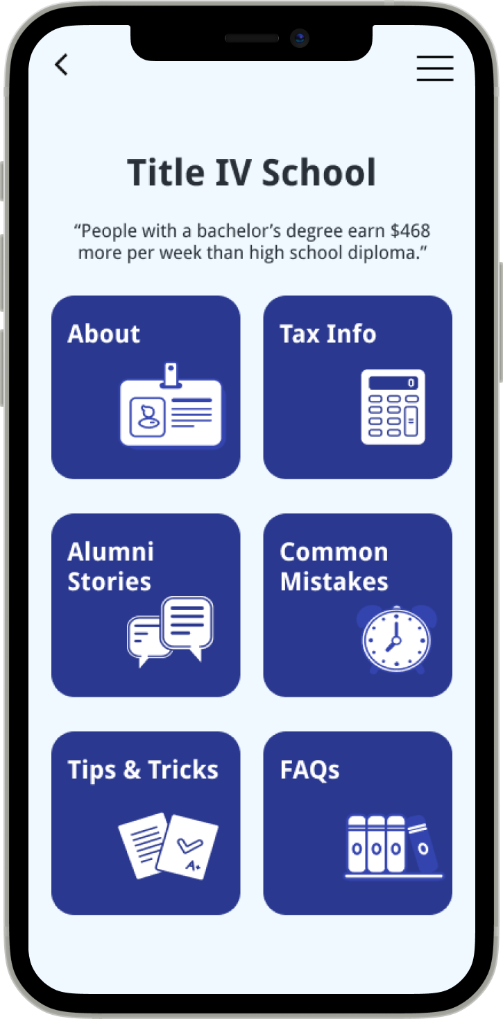
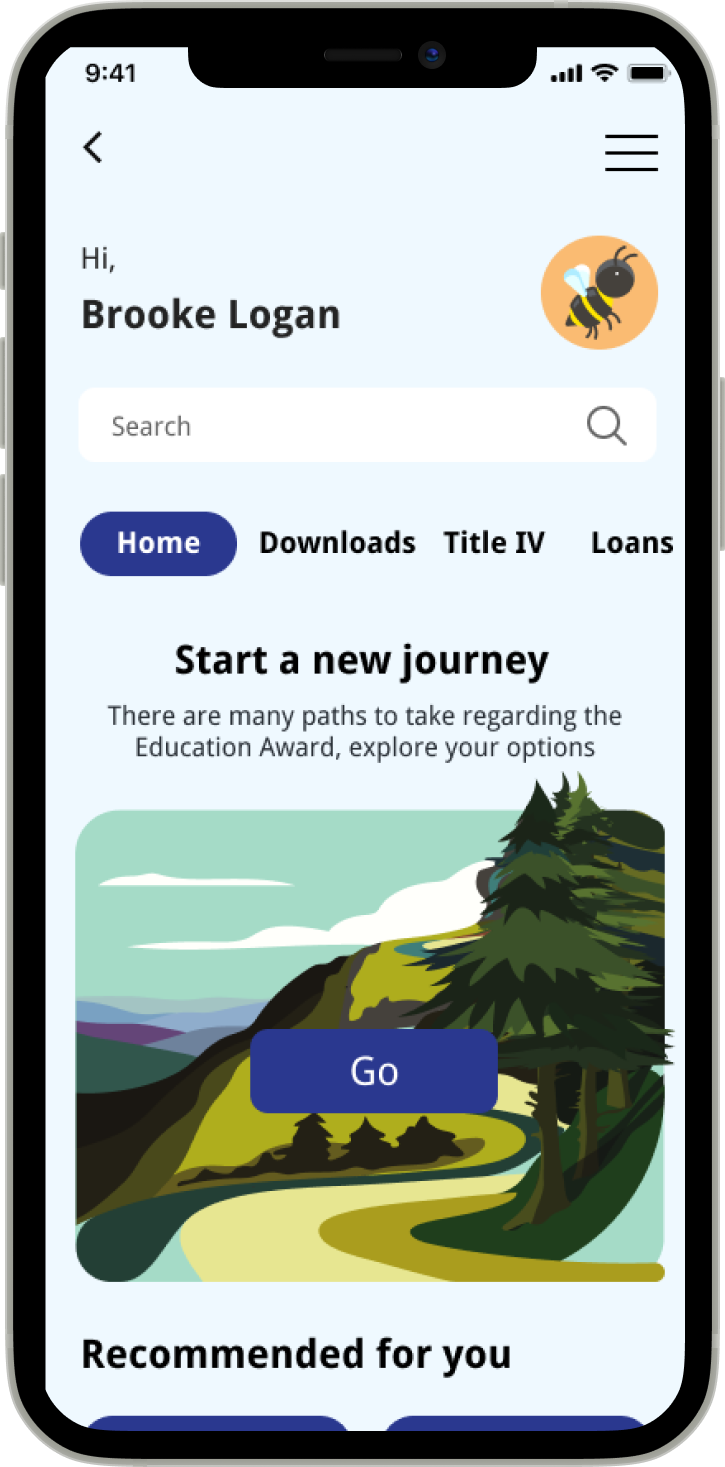
09. Visual Guide
With Do Good Be Good being a company that aid's a government-funded program, Sharon expressed that accessibility was one of the top requirements for the app. Furthermore, she provided us with Do Good Be Good's branding kit and asked us to utilize it. After receiving the kit, as a team we made sure it meets WCAG guidelines by checking the color contrast.
For the purposes of this project, we used Droid Sans as the sole typeface as it was the closest typeface we could access that was related to the DGBG’s typeface, Droid Serif. For future development, a font within the brand kit would be recommended.
The Imagery chosen complemented the potential for customization as AmeriCorps members explore the different paths they can take with their Education Award. However, the icons used through the design are supposed to work as placeholders and we recommended our client to work with an illustrator to create proprietary illustrations


